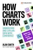
How Charts Work Understand and explain data with confidence
Article update with video of the event
Understanding Data
Communicating with data effectively is an increasingly important skill, yet is often overlooked.
This session covers some of the essentials including understanding your audience, choosing appropriate chart types, and making best use of text and colour to produce engaging content.
Alan Smith OBE is the Head of Visual Data Journalism at the Financial Times, and offers unique insight into how to present your data in a unique, effective, visually striking way.

Tags
More articles in this category:
- Why Should Critical Thinking be on your Radar?
- What skills will I develop from undertaking a social science research project?
- Avoid lazy writing in your academic essays
University of Greenwich, Student Support
For more information and support on this topic from the University of Greenwich - please click here
Suggested reading
How Charts Work: Understand and explain data with confidence: Understand and explain data with confidence
Paperback
Smith, Alan
WAS £16.99 SAVE £1.70
£15.29
View

